Apex Professional Fitness
Tuesday, 22 August 2017
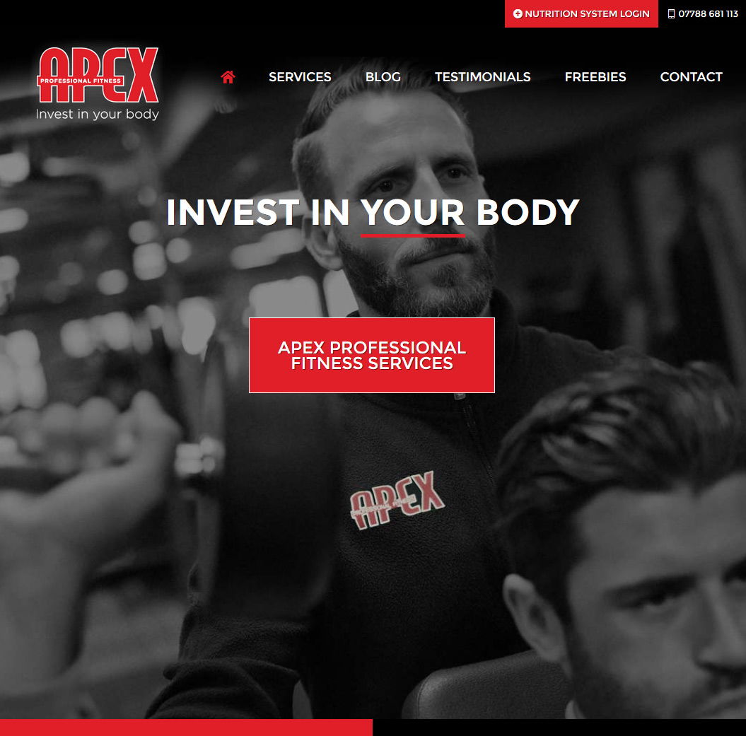
Having a thriving fitness business is one thing Apex are proud of, having spent the last few years growing his client list and expanding the fitness offerings Danny from Apex Fitness wanted to make his website match the business in terms of projecting the professional look and nature of what Apex offers its clients. With a fantastic nutritional system to boot Danny wanted rid of his tired word press website and also wanted a website that showcased his services with an easy to use navigation.
Striking Responsive Website Needed
The old site had become bloated and it was just too tricky to find anything. So we met up with Danny and went thought what we could offer, the result is a striking colour way that matches the Apex brand and a combination of large black and white images to deliver a clean website design that flows beautifully down to mobile size.

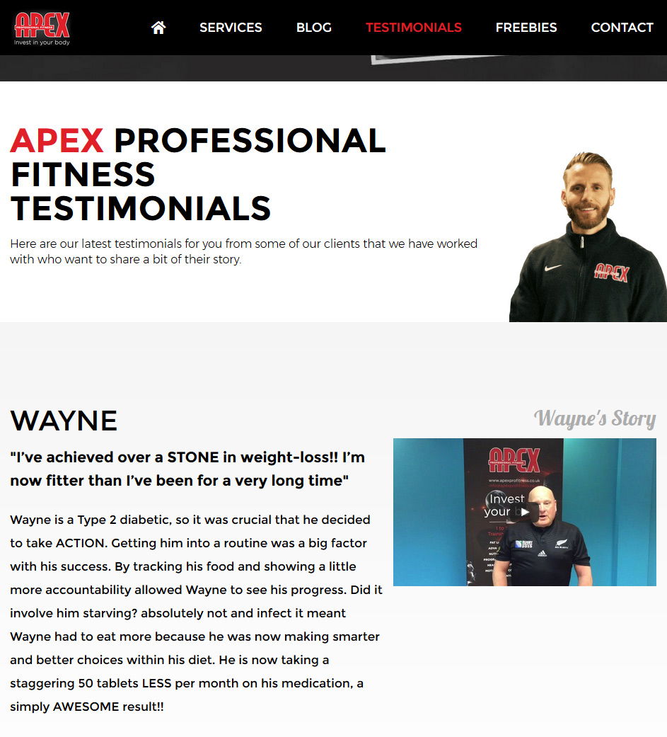
The main goal of the site was to show the offerings including the nutritional system and show testimonials from real people along with a video. Keen not to make the testimonials look boring and bland the videos really help push the message of Apex and the real people give the site the tools that Apex need to expand the business even further.
Ready For Mobile
Another big need for the website was for the mobile aspect of the design to be key, the website was designed with that in mind and the mobile view was as important as the desktop view. The responsive website that was delivered retains the brand while keeping the vertical scrolling area nicely blocked into sections that are easy to tap target and view.

