6 Web Design trends for 2019
Thursday, 23 May 2019
Web design is an exciting sector to work in as it is an ever-changing landscape that combines creativity and technology to produce some really cool online techniques that can be integrated into a client's website. Every year we see more and more trends arise in web design and today we're going to discuss the ones we've been seeing in 2019 and well, they are exciting! Websites are being made to be more engaging, hitting users right in the feels and becoming a lot more creative, but in the most user-friendly way possible...
1.) Vintage Style Text
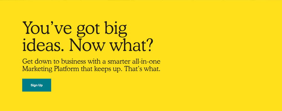
We've slowly seen serifs creep their way over from the traditional print world to create an older, vintage sort of feel to website typography. They're often being used in headlines or straplines to emphasise in a stylish manner and to stand out amongst a field of sans text, of which still seems to be the favourite for the majority of text-based websites with how easy it is to read. The serif fonts are adding personality to brand's websites and often create a great contrast towards their simpler pairings.
2. New Shapes
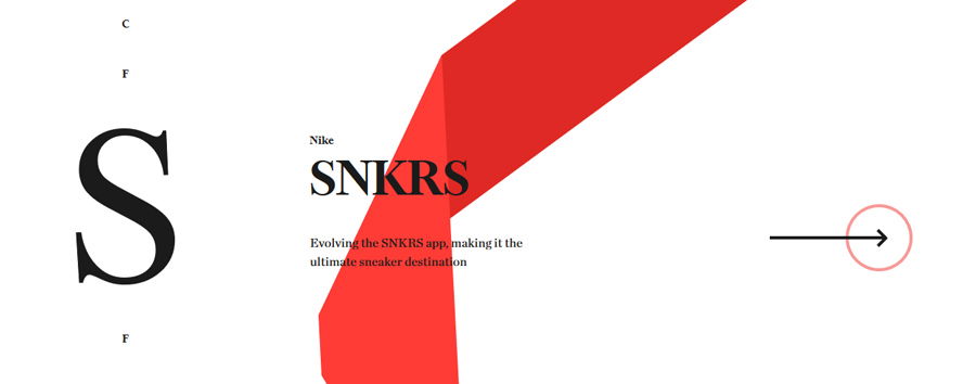
We've been through a number of phases when it comes to using shapes online, from favouring circles to squares and usually restricting websites to clean shapes and lines that flow geometrically, usually in a grid format. We're now beginning to see a transition to more unusual and ‘wavy' shapes that don't flow as straight as their rigid alternatives, allowing for certain elements to stand out even more. They can help bring websites to life for those that may seem more static.
3. The Age of Microinteractions
Microinteractions have been somewhat of a buzzword in the web design agency for some time and rightly so, we have seen the popularity of them continue to rise, especially in 2019. They are essentially a small animation to highlight a task that's been done and create a buzz for the user. They can be used to improve navigation, provide feedback to the user after they've completed a specific action and most of all, provoke emotion with your user. They are a fantastic way to improve user experience and make your website one to remember.
4. Surreal illustrations
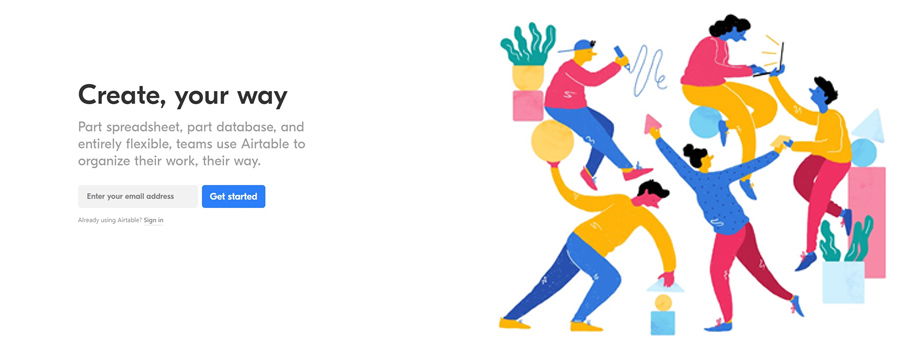
Another technique that seems to be targeting emotion in 2019 is the use of abstract and surreal illustrations throughout a website, giving a sense of the real world, but not quite. It allows for the end user to almost be able to relate to something or to see an element of themselves within the image. The style of illustrations we're seeing is often using bright and bold colours to emphasise playfulness and to keep web users interested.
5. Taking it Split Screen
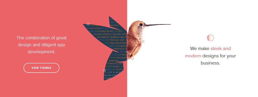
Split screen isn't exactly new in web design but the implementation of an interactive element has been on the rise. With many designers integrating a ‘slider' on their split screen, it's allowing users to take control of their experience on desktop and also have an effective experience on mobile too. The functionality is easy to implement and effective in terms of design and we've also seen the rise of asymmetrical splits to offer a hierarchy of importance in the website structure.
6. 3D Spaces
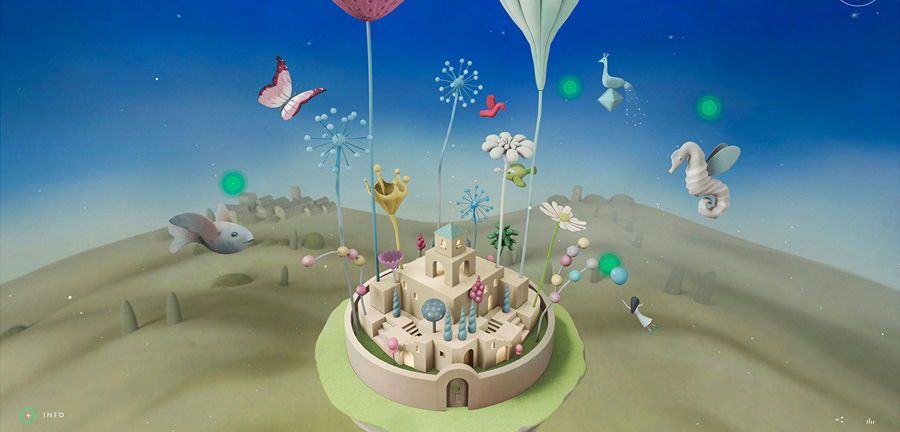
3D isn't exactly new for 2019, we know that. But most commonly being used in video and film is now beginning to transfer into web design to provide a more high-quality experience for the user. Whether it's creating a fully 3D world for the user to explore or providing a complete 3D render of a product on an e-commerce website - we've seen 3D being used in a number of ways to visually explore a whole catalogue of website elements. As VR is so hard to replicate online, it's a progressive step forward in terms of creating a different reality.
With so many developments happening in the digital sector, we're excited to see more and more trends pass through 2019. Are you wanting some of these design elements integrating into your website? Get in touch to see how we can help you make it a reality for your website.
