125% increase in enquiries for Shrewsbury Club
Wednesday, 9 January 2019
Driving traffic to your website is the first task, but are your visitors converting to customers and contacting you. See how we helped the Shrewsbury Club to more than double their enquiries.
The Shrewsbury Club is a family orientated health club and spa in Shropshire and although traffic figures were very healthy, not enough visitors were getting in touch. So the wayfresh team were called in to investigate and to see what we could do to increase customer conversions.
The main focus of a health club is attracting visitors to sign up to a membership and the facilities at the Shrewsbury Club are incredible so once they actually visit the club to arrange a tour, the sign up rate is more than 90%. So the issue is getting more people to arrange a tour of the health club facilities.
First up – Heatmaps
We needed to see the customers' engagement with the website and so over a few days we used heatmaps and recorded visitors to the website interacting with the website and also did a site audit.

The results pointed us to 3 main issues:
Issue 1 – Call to action: From heatmaps and visitor recordings we immediately noticed there was a lot of dawdling and contemplation over pressing the Join Today member.
Issue 2 - Content: Also there was a lot of scrolling up and down the Membership page which implied that the customer hadn't found the information then were looking for.
Issue 3 – Sign up forms: We also noticed that when the customer got to the sign up form on the page, there would be a large drop out either before or during the form completion.
Let's review each of these.
Step 1 – Call to actions
With the amount of hesitation surrounding the button click we assumed this may be due to the call to action being too sales focused and direct. The whole message screams “join now!” so it's possible that the visitor felt that clicking would take them straight to a membership sign up form, whereas the sale is nearly always made once they visit the club.
So we decided to do a bit of A/B testing and every few hours we switched from the above call to action to the below.

This call to action is a lot softer and less salesy. The focus is on inviting the customer to come in for a tour of the facility and doesn't mention membership at all.
Over a 2 week testing period we noticed a 50% increase in enquiries from this simple change.
Step 2 - Content
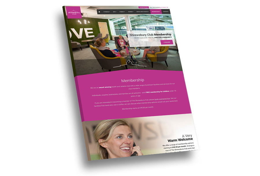
The Shrewsbury Club use Pay Per Click (PPC) to drive traffic to the membership page of the website and although there was good traffic, the conversion rate was low. The heatmap study showed that there was a lot of scrolling on the page which implied that the visitor was still looking for information.
So to fix this we tripled the size of the membership page to include as much information about the club as possible. So if a new visitor came in through PPC, then all the information they would need to make a decision would be on this page, meaning they wouldn't have to click about the whole site.

This increase in content, imagery and additional videos again increased the enquiry rate.
Step 3 - Sign up forms
Through our site audit and the heatmaps we determined that some visitors were being put off with the size of the forms, as when enquiring the Shrewsbury Club tended to ask plenty of questions in order to find out the best person to speak to the customer.
The standard web forms can also be a little cumbersome on mobile devices. So rather than reduce the information we used a new conversation form called Typeform.
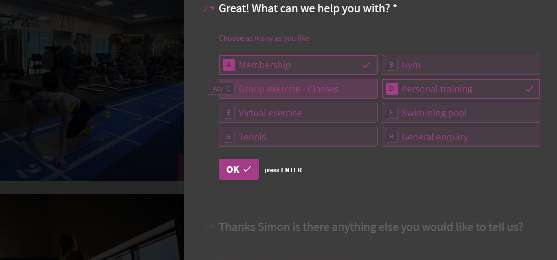
Typeform is new and easy way of asking and answering questions. It can ask single questions at a time, uses buttons rather than dropdowns for multiple choice and also personalises the questions.

So using Typeform we immediately ask for the customer's first name and then use that when asking further questions to totally personalise the form.
We then lead the customer through the form by asking questions where they can press buttons rather than typing making the form much more interactive and easier to use on mobiles.
Finally as we are only asking a single question at a time, the visitor is far more engaged and willing to complete the form.
All this resulted in over double the amount of enquiries across the whole site.
Conclusion
Working on this project was a great insight into customer behaviour and how a few small changes can result in a 125% increase in enquires.
Simple changes such as the way a call to action is worded or the amount of information on a page can make an incredible difference.
Engaging customers with new technology especially when it makes it easier on a mobile device is always a must.
We have now been using Typeform on all our new websites for the past 18 months and have noticed an incredible response rate in enquiries and a much lower rate in visitors abandoning the forms midway through completion.
Please get in touch if you would like to see how wayfresh can help you increase your enquiries.
